How to Make a Before/After Comparison Image
A good before/after picture does the arguing for you: a renovation, a photo edit, three months at the gym, a cleaned-up garden. The catch is that the two photos rarely match: different sizes, different aspect ratios, sometimes even one portrait and one landscape. This guide walks through making a clean side-by-side comparison in about a minute, entirely in your browser.
Open the Image Combiner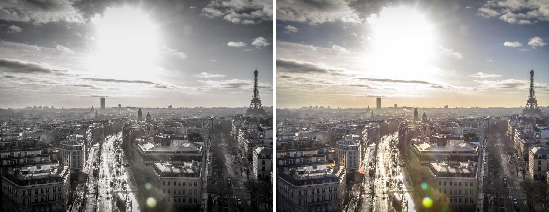
Step 1: Add your two photos
Click Add Images and select both photos at once, or drag them onto the page together. The order you pick them is the order they appear. If the "before" ends up on the right, just drag one photo onto the other in the preview to swap them.
Step 2: Choose the horizontal layout
The Horizontal layout is selected by default, and it is the right one here: "before" reads on the left, "after" on the right, the way people naturally scan. If your photos are very wide (letterboxed screenshots, panoramas), consider Vertical instead, since two wide images stacked are easier to compare than two wide images squeezed side by side.
Step 3: Make the two halves match
This is the step that separates a clean comparison from a messy one. In the Size setting:
- Reduce (the default) scales the larger photo down so both end up the same height. Nothing is cut off, and nothing gets blurry from upscaling. Use this when your two photos have similar aspect ratios.
- Crop trims both photos from the center to identical dimensions. Use this when the aspect ratios differ (one portrait phone shot and one landscape, for example) and you want two perfectly equal halves.
Step 4: Add the dividing line
With Spacing at 0 the photos touch directly, which works when the two scenes are clearly different. But if the photos are similar, with the same room and angle, a divider helps the eye find the seam:
- Set Border to around 0.5 to 1. The value is a percentage of the image size, so it stays proportional whether your photos are phone snapshots or 4K.
- Pick white for bright photos, black for dark ones. A colored border rarely improves a comparison.
- Alternatively, leave the border at 0 and set Spacing to 1 or 2 with a white background for a subtler, editorial look.
Step 5: Export
Click Download. For photos, JPG gives the smallest file with no visible quality loss. Pick PNG only if the comparison contains text or sharp UI edges (like app screenshots). The export happens at full resolution, using your original pixels rather than a preview-sized copy.
Common mistakes to avoid
- Mismatched crops. If "before" shows the whole room and "after" shows one corner, the comparison feels dishonest. Crop both photos to the same framing before combining, or use Crop mode.
- Different lighting doing the work. A dark "before" and a bright "after" exaggerates the change, and viewers notice, especially for fitness photos.
- Labels squeezed in afterwards. If you need "BEFORE" and "AFTER" text on the image, add it to each photo first (any phone editor can), then combine. Text added after combining tends to sit awkwardly over the seam.
Related
Making more than two photos into one image? See how to make a collage that fits Instagram, or the full FAQ for sizing modes, formats, and resolution limits.
Example photo via picsum.photos.